Creating game user interfaces (UIs) is a fun and creative process, and tools like Figma make it even easier. In this tutorial, we’ll explore how to design a UI inspired by the popular Royal Match game using Figma, a widely used tool for UI/UX design. Whether you’re a beginner or a seasoned designer, this guide will help you bring a polished game UI to life. Why Figma? Before we dive into the design, let’s quickly discuss why Figma is a go-to tool for designing game UIs: Cloud-Based: Access your projects anywhere, collaborate in real-time. Vector-Based: Crisp, scalable assets perfect for game interfaces. Easy Prototyping: Test interactions directly within Figma.
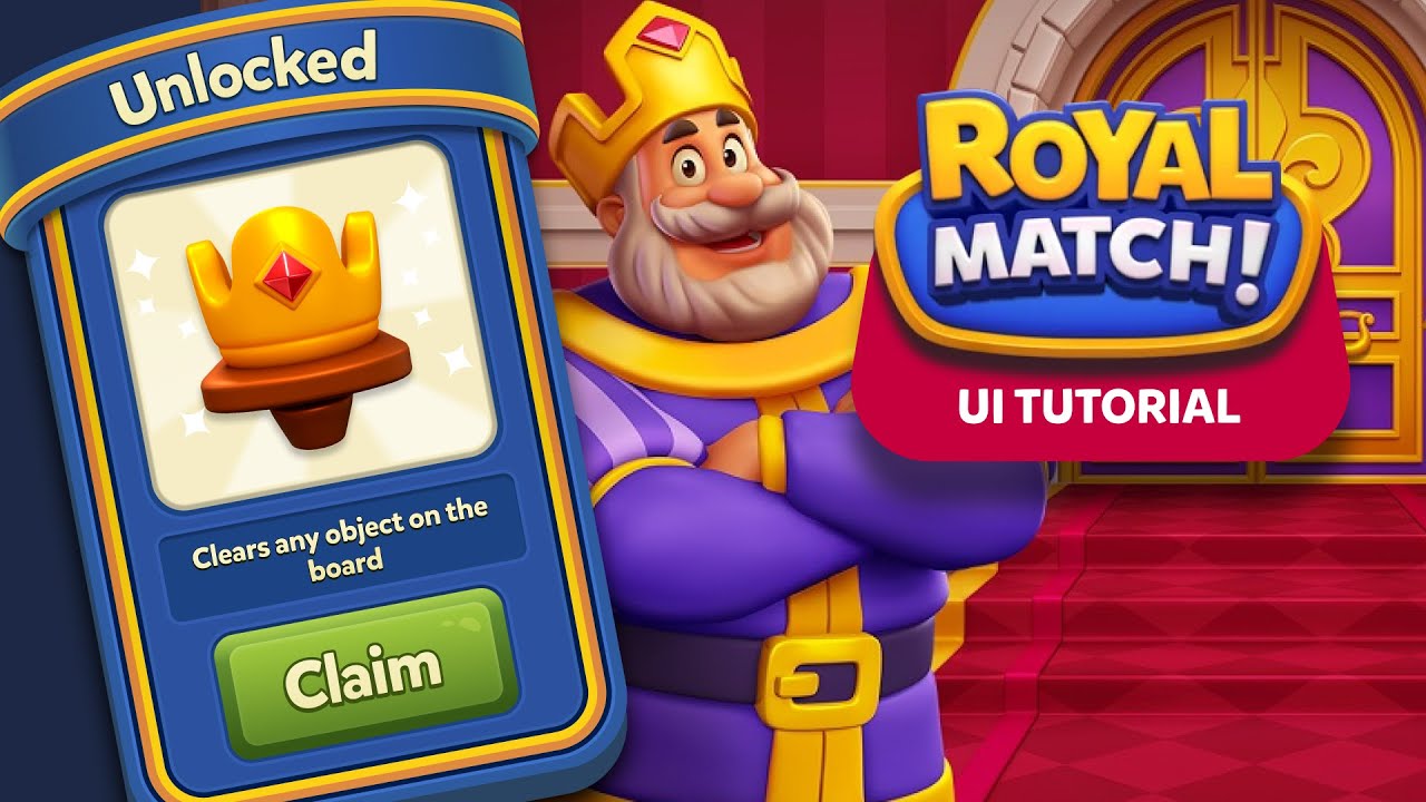
Plugins and Integrations: Speed up your workflow with community-contributed plugins. What Makes the Royal Match UI Stand Out? Royal Match is known for its bright, colorful design, and its simple, intuitive interface. The game draws users in with visually appealing menus, buttons, and smooth transitions. Let’s break down some key UI elements to recreate: Home Screen Layout: Centralized Play button with leaderboard, settings, and store icons. Match-3 Game Grid: The core of the gameplay with well-aligned tiles, clear visual hierarchy, and easy-to-understand actions. Pop-up Menus: For power-ups, level progress, and special offers. Character Art and Animations: Often part of onboarding and progress screens. Step-by-Step Guide to Designing a Royal Match Game UI in Figma 1. Setting Up Your Figma Project Start by opening Figma and creating a new file: Frame Sizes: For mobile games like Royal Match, choose a standard mobile frame size (e.g., 375 x 812 px for iPhone X).
Grid: Apply a simple 8px grid system to help with the alignment of elements. 2. Designing the Home Screen The home screen in Royal Match is user-friendly and rich with interactive elements. Let’s design a similar home screen in Figma. Elements to Include: Play Button: A large, center-placed button with a strong color (often a shade of yellow or gold) to attract attention. Secondary Buttons: Leaderboard, settings, and store buttons, usually smaller but still easy to find. Top Navigation: A header that includes in-game currency (coins, gems, etc.) and lives count. Design Tips: Use rounded corners for buttons and icons to give a soft, friendly look. Apply
shadow effects to make elements pop, similar to how the Royal Match game creates a sense of depth. 3. Building the Match-3 Grid Now, we move to the core gameplay UI — the match-3 grid. In Royal Match, the tiles are clean, colorful, and easy to distinguish. Steps: Grid Creation: Create a 7×7 grid using Figma’s repeat grid feature. Tile Design: Design each tile type (gems, bombs, and power-ups). Use a distinct color palette and add a slight glow or border to make them stand out. Interactions: You can prototype swipe interactions for matching tiles using Figma’s built-in prototyping tools. Design Tip: Ensure that each tile has enough spacing to avoid clutter, and use animations or transition effects to simulate the game’s action. 4. Designing Pop-Up Menus Pop-up menus in Royal Match provide important information like level
progress, boosters, and special offers. Key Elements: Power-up Icons: Design unique icons for boosters like rockets, bombs, and color bombs. Reward Windows: Create pop-ups that appear when users complete levels or purchase in-game items. Add celebratory elements like confetti animations to make the experience feel rewarding. Design Tip: Maintain consistency with the color scheme and font choice, and use subtle shadows and gradients to give the pop-up menus a 3D feel. 5. Adding Character Art Royal Match often features cute characters that guide users through tutorials or gameplay. If you want to include character art in your game UI, you can: Create
simple vector characters using Figma’s pen tool. Use pre-designed illustrations from Figma’s community or third-party sources. Add subtle animations like bounce or fade-in to make the characters feel more interactive during onboarding or level-up screens. Prototyping and Interactions Once you’ve created the static designs, it’s time to bring them to life using Figma’s Prototype feature: Button Interactions: Set up navigation for the Play button to lead into the game grid. Swipe Gestures:
Simulate swiping tiles by creating transitions between screens. Pop-ups: Prototype pop-ups to appear after a certain user action, such as completing a level or purchasing an in-game item. Figma allows you to preview how the game UI will function, and you can even share the prototype with others for feedback. Conclusion Creating a game UI in Figma, inspired by the fun and colorful design of Royal Match, is an exciting project. By following this tutorial, you’ve learned how to design essential elements like home screens, grids, pop-ups, and character interactions. Figma’s robust design and prototyping tools allow you to create highly interactive and polished game UIs, perfect for mobile games. Start your own project today, and explore how you can expand on these ideas to craft an even more unique and engaging game experience! Happy designing!